
Eric
-
Posts
1,284 -
Joined
-
Last visited
-
Days Won
68
Everything posted by Eric
-
It might be a lot to write down, and it might also be completely useless. So, just to set your expectations...
-
There are a few elements that are very faint, and almost invisible until you hover nearby. Report Post shows up when you move your mouse over any part of a post. Same for the little icon to share a post, or hide a signature. Also, on the Topic List, the page numbers associated with a thread on the Topic List. They don't really show up until you hover over a specific topic. It's a design decision, I think. There are a lot of features and interface elements, and giving them all the same visual weight leads to an overwhelming and cluttered UI. Only showing some elements on hover helps to minimize that.
-
Computer Gods. What have you done? The only solution requires travel to a volcano. Honestly, it could be a million different things. There's a very slight possibility that the two problems are related, a screwy video card/video drivers maybe. Windows is a complicated thing, and once in a while things get... I'll just say I have a word for it. Identifying issues causing random reboots isn't an easy thing to troubleshoot, but if it's a blue screen you're seeing (pretty rare these days) make sure to write down the details, usually under the heading "Technical Details"
-
If the problem is specific to Peachtree, you don't notice wonky fonts anywhere else, and it returns to normal after a restart of the application, there are a couple possibilities I can think of. You've angered Peachtree and/or the Computer Gods. There is no fix.There could be a zoom/font size adjustment feature that's getting triggered by a key combination/stuck keyboard key.EDIT: After a second look, I'm leaning more toward toward the first possibility. The menu bar across the top is especially broken looking, and not what you would expect to happen when using an application's built-in font size adjustment.
-
I've darkened both the default text and the medium grey text so that they're both still distinguishable. Also further darkened the border around each post. If it still looks very faint to you, is there another computer/monitor/tablet/phone you could view the site on for comparison to see if it's possibly a calibration issue? (brightness/contrast being off) If that's the case, I can point you to sites/tools for monitor calibration.
-
I am getting a feeling that we've got problems with email deliverability. Possibly due to an IP address range being blocked by a spam database. I'm going to migrate the site to my new server tonight or this weekend, and I am hoping the issue will be resolved. If not, I'll look at the error logs and do some further testing.
-
I'm not sure. I'm looking at my tiny 13" laptop screen and everything seems easy to read. Perhaps it's a monitor calibration thing? I've darkened up the medium grey fonts, but I'm not sure it's making anything more readable. If anything, I feel like the medium grey text now blends in with the dark grey text where they're adjacent, making things a little less readable. I'm going to put it back for now until Michael can respond with specific text that I can target and change the color of.
-
Thanks!
-
I should make it a little more clear, I think. It's not as if uploading more images or documents directly affects the amount of money spent on hosting. My server has a number of SSD drives in an array, and that available space is used for websites, data redundancy, and for daily backups of those sites. Each site has a quota for certain resources which can not be exceeded. I've dedicated about 25GB of drive space to this site, which we're not close to using up... so making a small change to attachment limits is really just a drop in the bucket. Few members fully utilize their full attachment space, so it's a very small drop.
-
Can you give me an example of the text that you're finding difficult to read? If I know exactly what text to adjust, I can darken it a bit.
-
I've noticed that too. And I always find something to edit just as soon as I hit the button. I'll check it out.
-

Eric - Where is the button to take us to the last unread post?
Eric replied to BulldogTom's topic in General Chat
Glad you got it sorted, I don't think I would have thought of that. -
Eric - Where is the button to take us to the last unread post?
Eric replied to BulldogTom's topic in General Chat
Just in case others are looking for it.
-
It's there, but it won't allow you to delete attachments that have been included in a post. It provides a link to the posts that you have included the attachments in... if you go to those posts, edit them to remove the attachments, you then have an option to delete from My Attachments. It's kind of a pain, but it's a feature to help keep broken links/images to a minimum.
-
Members list has been removed, and functionality moved to the search. If you miss the tab at the top, I can create one that brings you right to a members search. You can manage your attachments by clicking your name at the top-right, and choosing My Attachments from the list... I'll also increase the limit to 20mb. I worry about increasing it too much because we have a lot of members and SSD drive space isn't cheap I might also suggest dropbox for sharing docs publicly?
-
Feel free to bring up any features/items that you miss from the old forum and I'll look to see if they have been removed or simply disabled by default in the new software. I'll check out the Members list soon. I have a feeling that the member you're talking about registered, but hasn't yet validated their account by clicking the link in their email. There may be issues with email deliverability, but I'm not going to troubleshoot them on the existing server with a move happening very soon.
-
I typed that from my phone. That was exhausting. So, I know nobody is looking forward to another period of downtime, but I think the wait will be worth it. All of your donations around the end of tax season made the upgrade possible, so I'd like to take advantage of it right away. You might not notice a huge difference, but I measure website performance in milliseconds, and the new software is measurably slower on the existing hardware.
-
I was a little worried about how the new software would run, and things just don't feel as snappy as they used to. I imagine it'd get even worse around tax season when the site is under heavy load. I have a new server being built this very moment with much beefier hardware including a RAID 10 array of SSD drives. I'll most likely do the migration this week, but the downtime should only last a few hours. I'm going to try to get it done in the evening.
-
I agree, but now I'm tempted to re-crop the image to center the spiral I couldn't believe the hate the circles were getting on the software vendor's forum. Anyone who feels that strongly about circles has deeper issues than we can help with, so I think the circles are here to stay. Glad the small style changes helped... it's amazing the difference a few very subtle changes can make. I agree that everything kind of blended together before.
-
Eric - Where is the button to take us to the last unread post?
Eric replied to BulldogTom's topic in General Chat
Same here... and I also like that there's a tab on that same popup to view the latest post too. -
Profiles photos are back, as I'm sure you folks have noticed. Let me know what you think about the circular images. I feel neutral about them, but I've seen both positive and negative feedback about them on the vendor's company forum... so if a bunch of people strongly dislike the circles, I can modify the stylesheets to make them square.
-
Likes are back to the way they used to be, but I'm going to have to look into the notifications thing. Messages work differently too... you don't delete a message, you leave the conversation, and once everyone participating in a conversation leaves it, the server deletes it automatically.
-
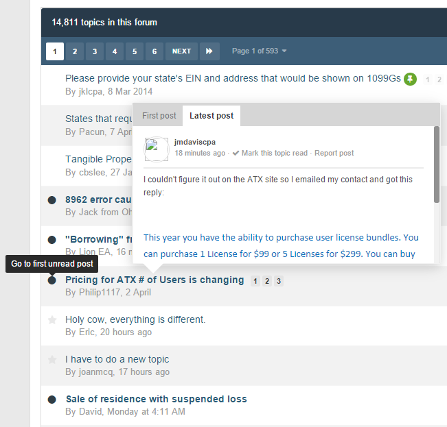
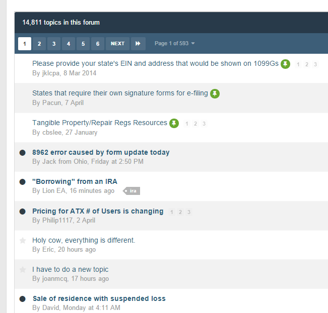
Jump to first unread should still be there... the little dark circle to the left of the thread should do it. Also, when you hover over the thread title, a card will pop up giving you a glimpse of the first post. There's also a tab on that card to get a look at the latest post. See attached screenshot. In the Forum List, General Chat, ACA, etc, the icons on the left show whether there are threads with unread posts in them. In the Topic List, all threads with unread posts should be bold. See attached screenshot.
-
I've changed the MyATX link for now, and I'll wait for a little more feedback to see if it should stay that way. I'm wondering if people have their logins "remembered" on MyATX, they my not need to go to the login page every time. I've fixed signatures, no need to change anything on your end.
-
I don't have a backup of the old code, so I'm not sure what the old url is. Is this right? https://support.atxinc.com/User/Login.aspx Sorry, I don't have an answer for the second question... I can suggest another shortcut though, F5 on your keyboard will refresh any page.